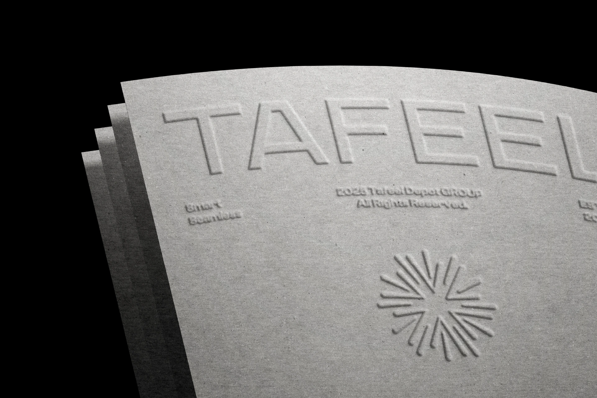

Tafeel
Tafeel is a digital transformation company focused on activating intelligent futures through strategy, design, and technology.
Tafeel is a forward-thinking digital transformation company that helps organizations evolve, scale, and innovate in an increasingly complex digital landscape. The brand was built to reflect clarity, intelligence, and momentum—capturing Tafeel’s role as a catalyst for meaningful change.
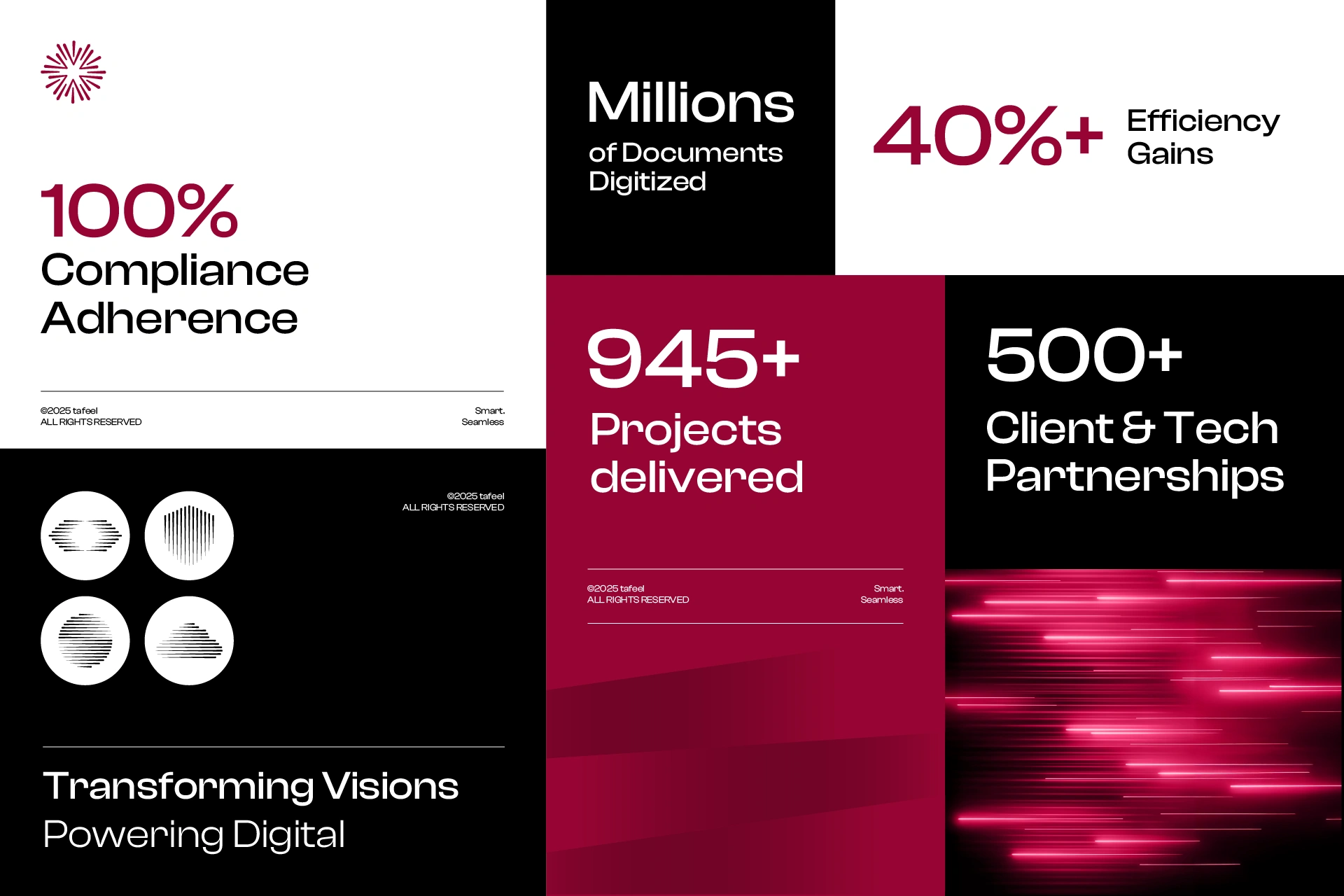
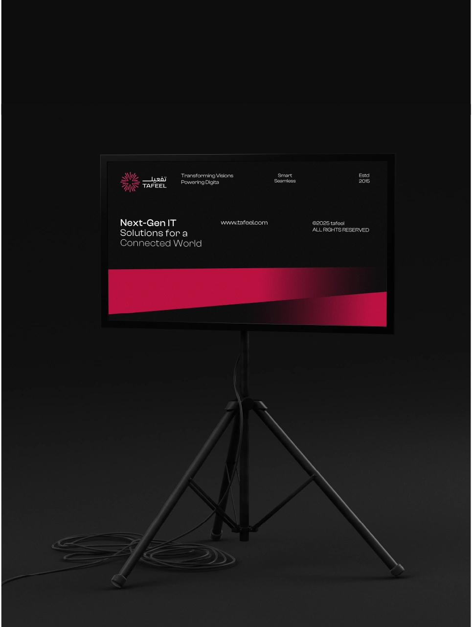
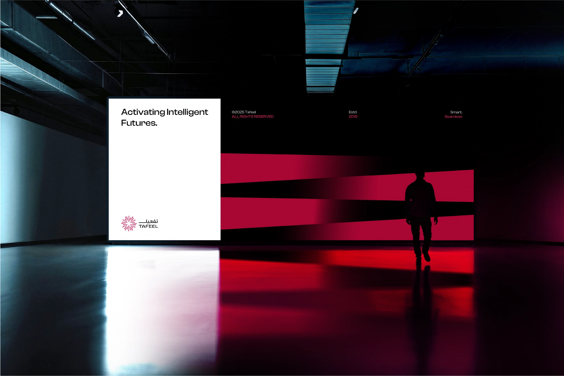
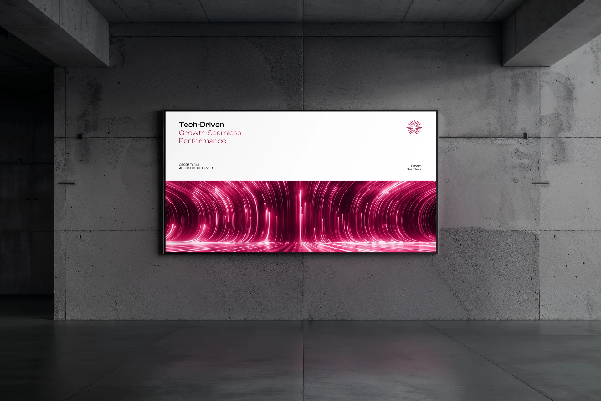
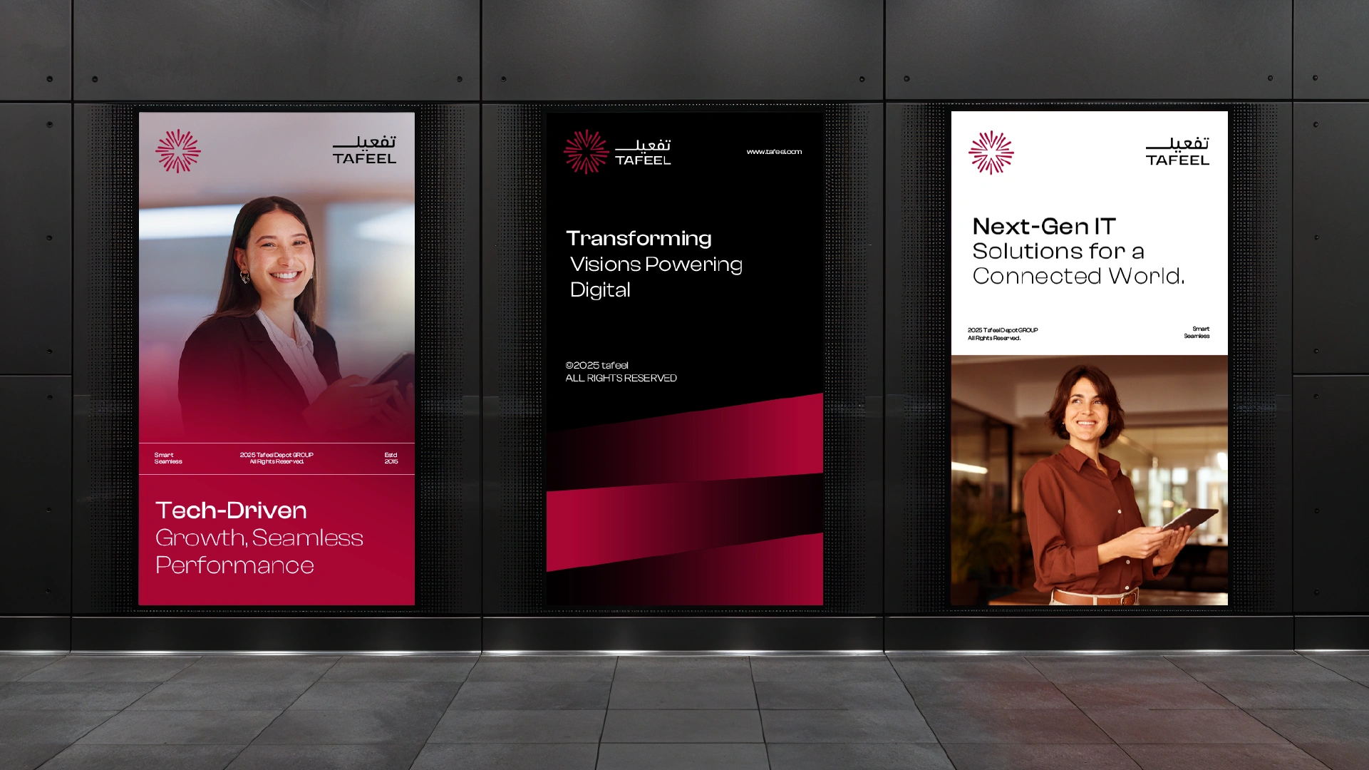
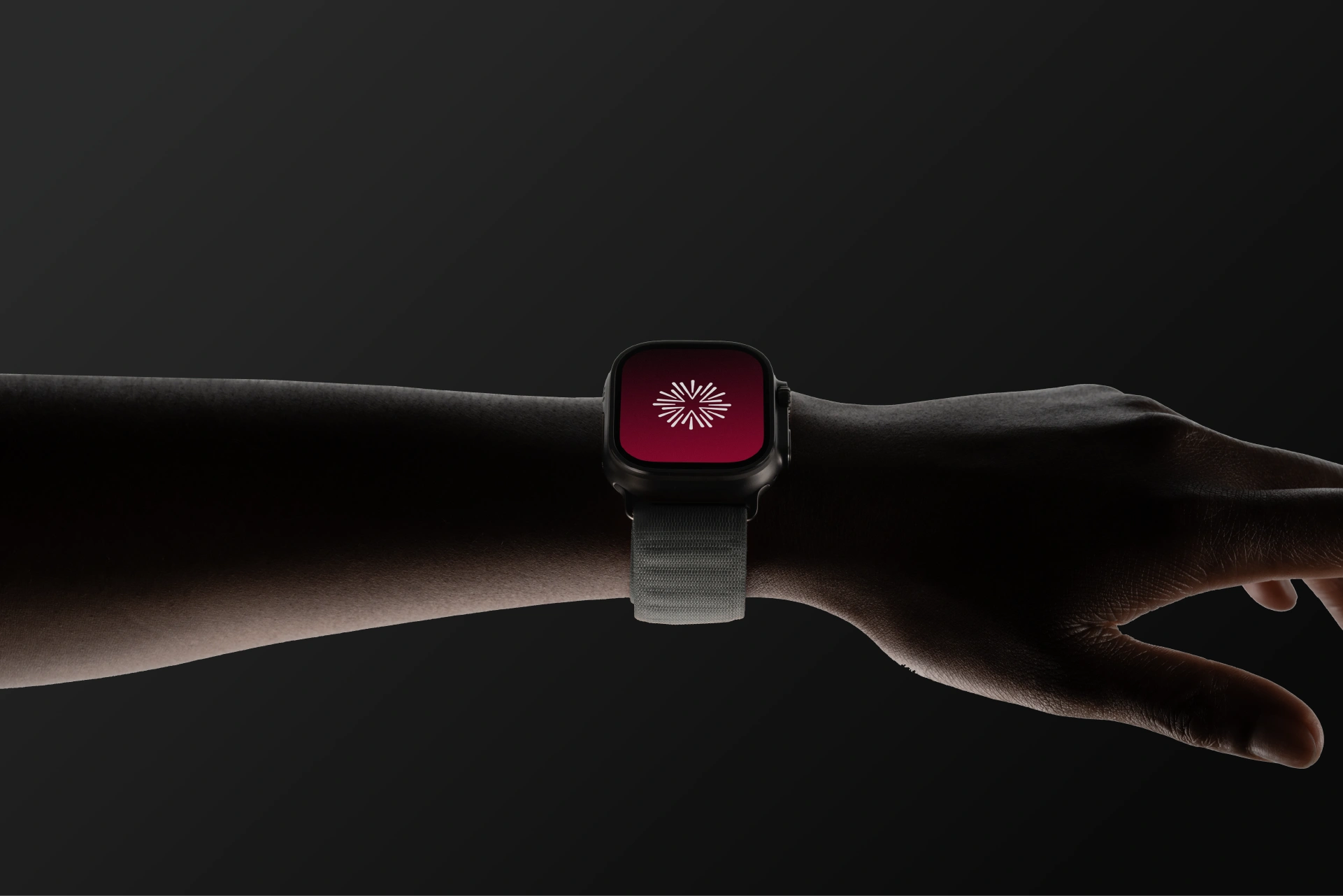
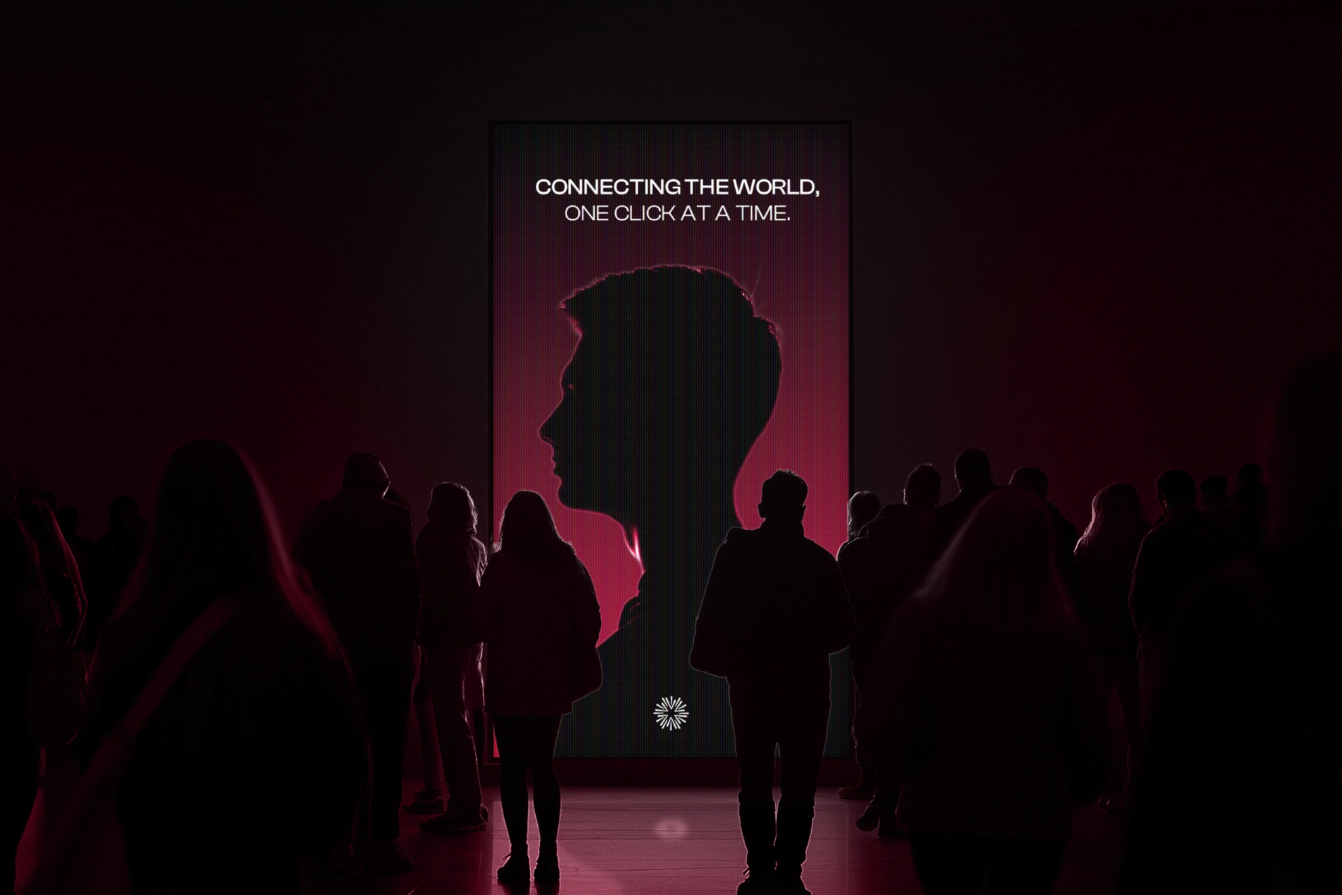
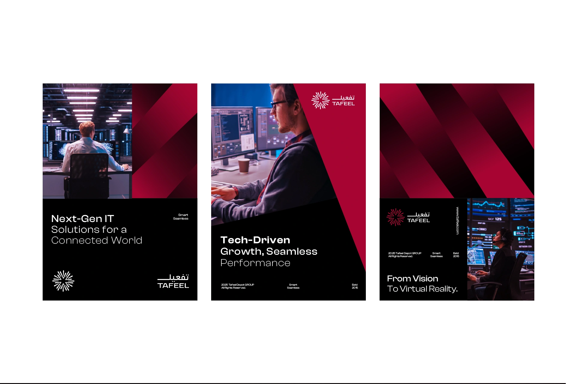
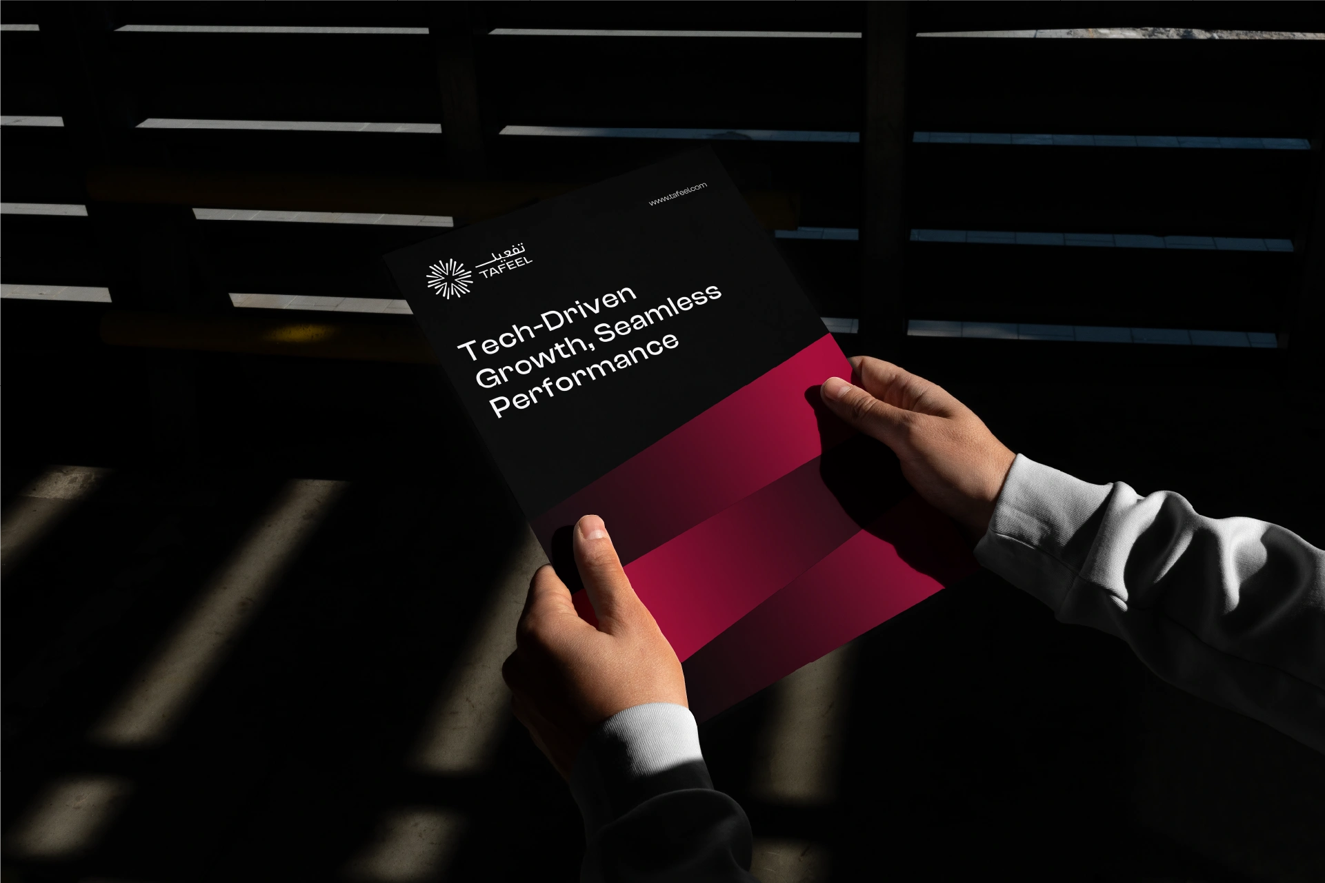
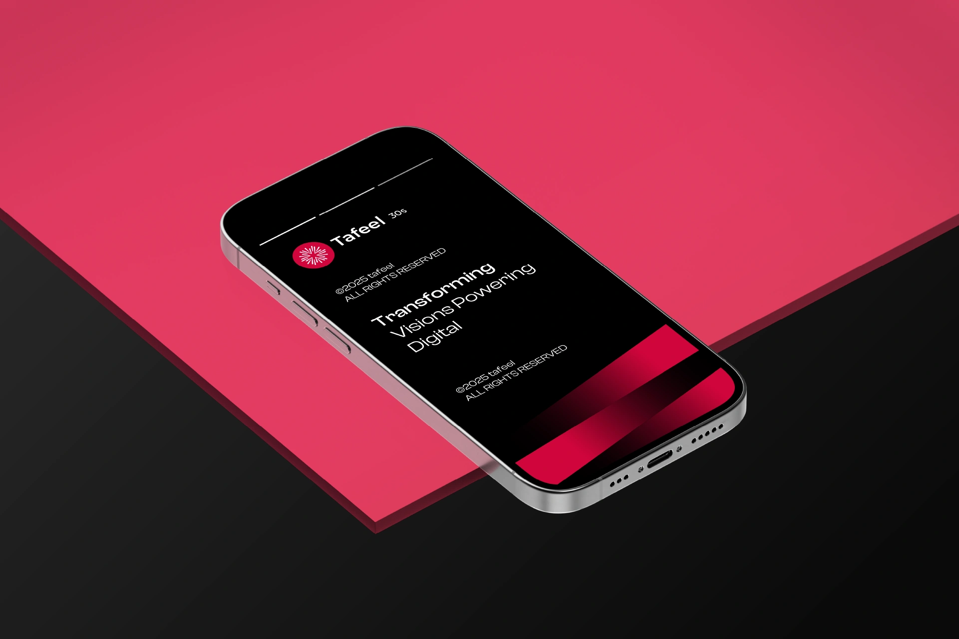
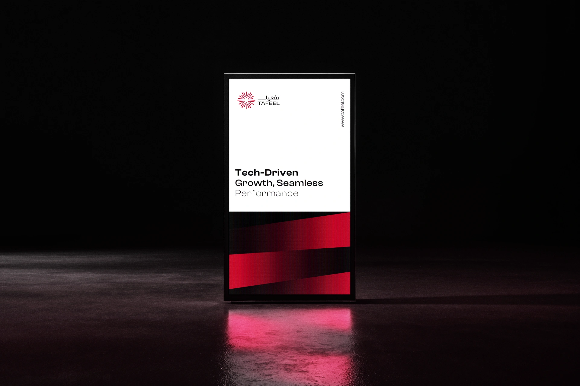
Our approach centered on translating abstract technological concepts into a bold, human, and confident visual system. Through a refined identity, dynamic motion language, and a flexible design framework, Tafeel’s brand communicates trust, innovation, and long-term vision. The result is a cohesive brand experience that positions Tafeel as a partner in shaping intelligent, future-ready solutions.
Tafeel
Tafeel is a digital transformation company that leverages advanced technologies to empower businesses across sectors including cloud computing, cybersecurity, retail, government, and healthcare. Built to serve both public and private clients, Tafeel delivers tailored digital solutions with a human centered approach , turning vision into real world impact.
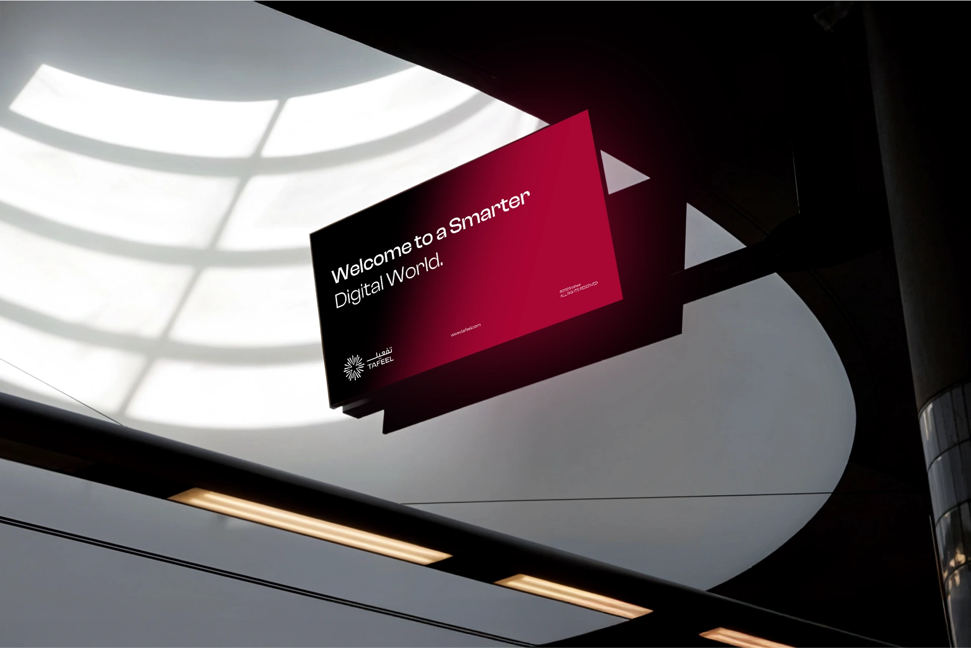
The Challenge
The challenge was to create a brand identity that could reflect Tafeel’s technical excellence and its ability to simplify complexity for clients. The brand needed to communicate clarity, intelligence, and trust while staying accessible, modern, and scalable for government contracts and private sector innovation alike.
The Strategy
We positioned Tafeel as the enabler not just of systems but of possibilities. The brand strategy focused on transformation through insight, not just implementation. The name Tafeel reflects action, enablement, and movement, which informed every layer of the brand architecture, voice, and interface. The messaging and visual language were built to convey both depth and simplicity.
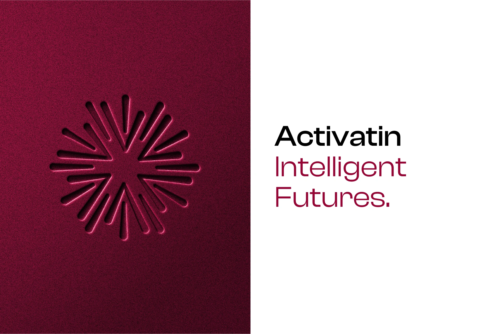
The Execution
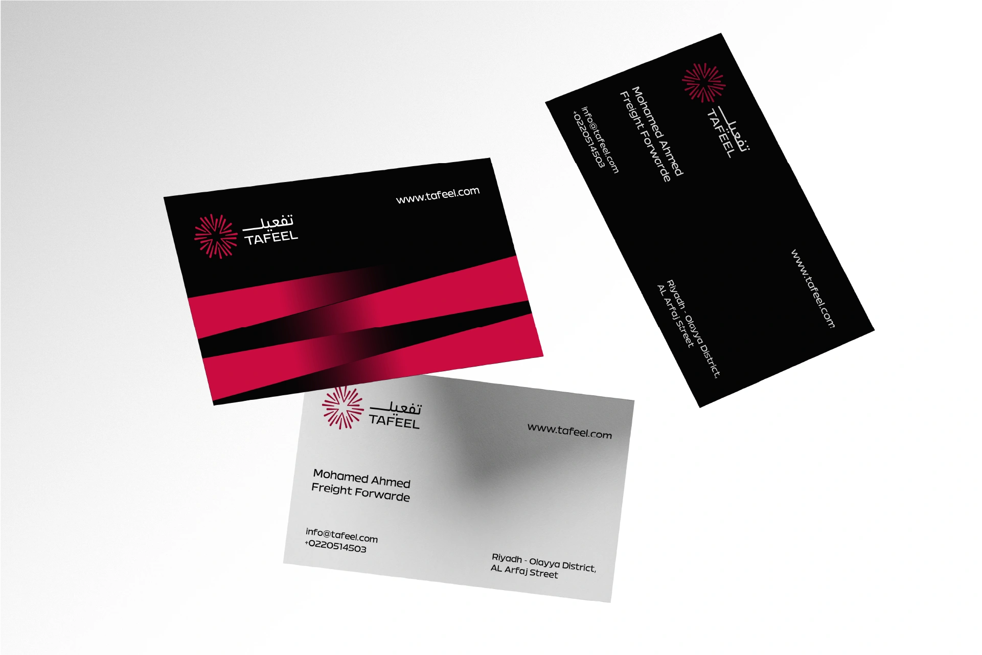
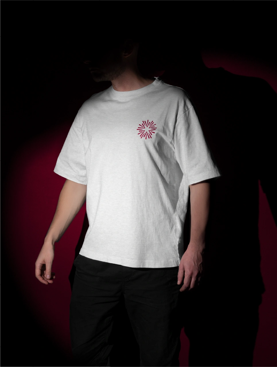
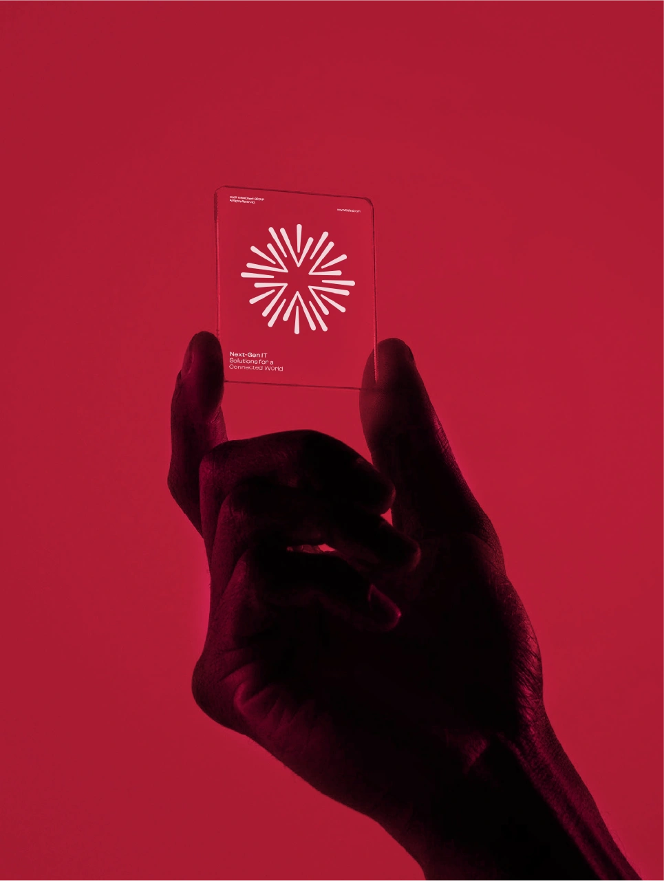
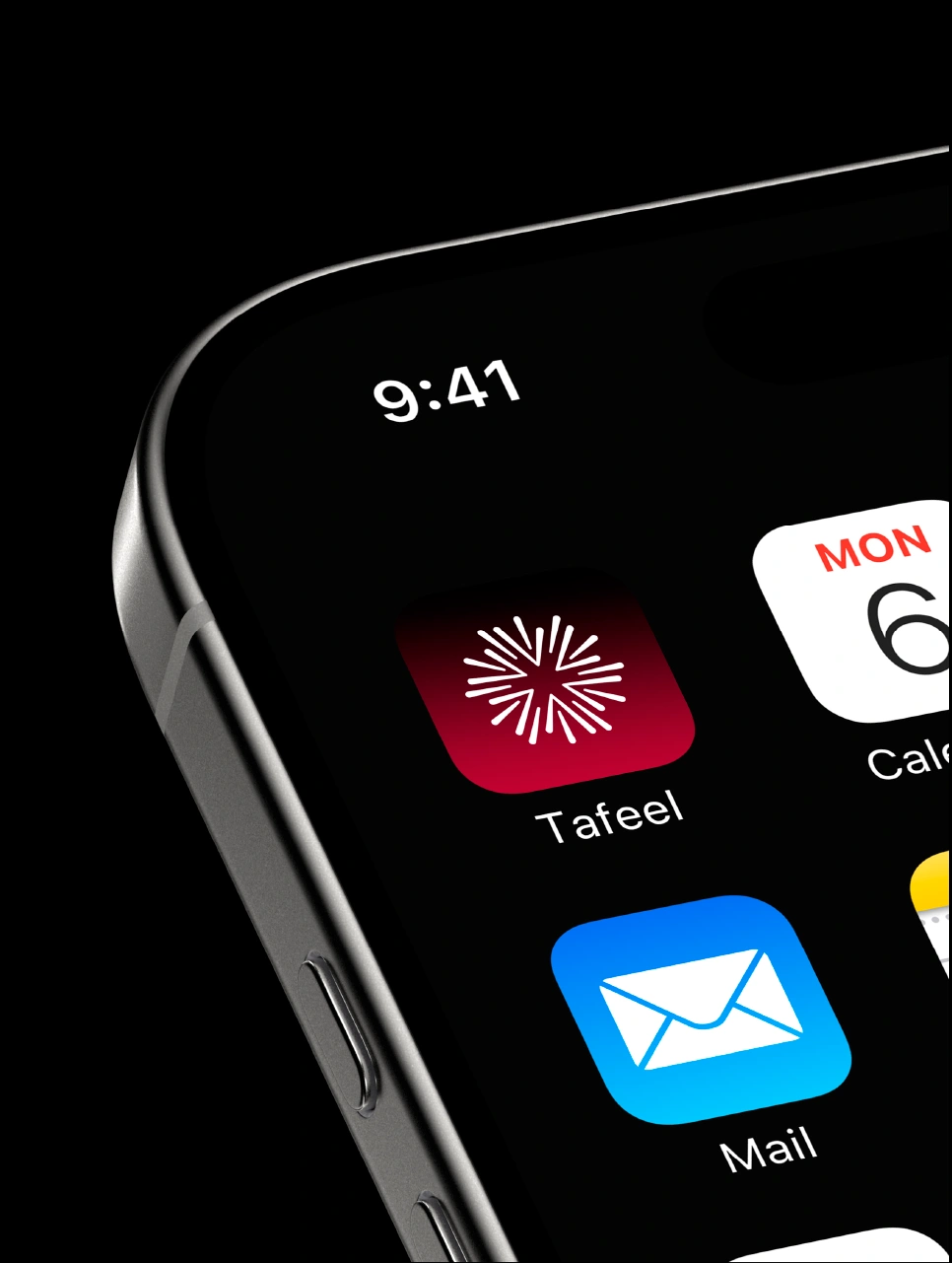
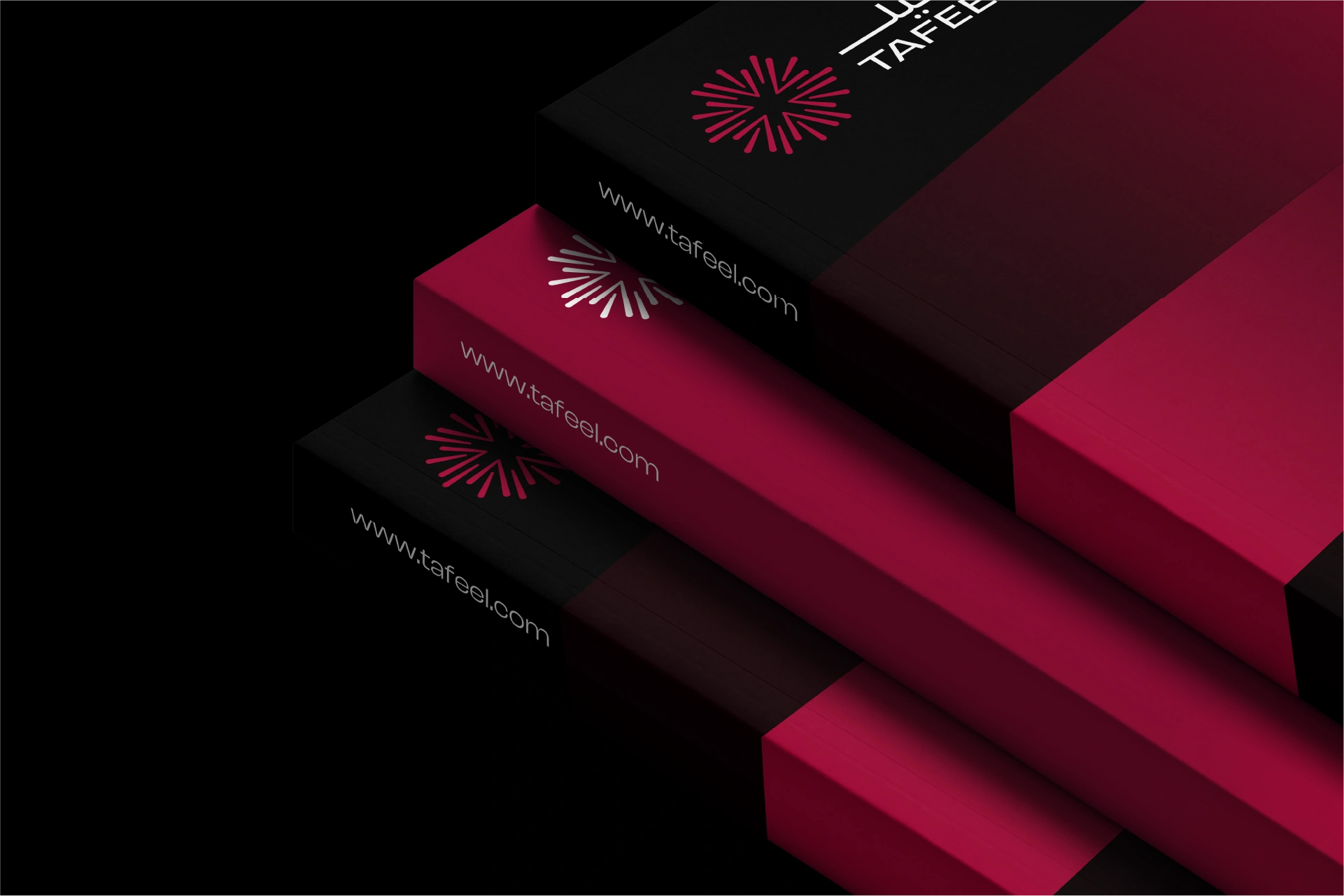
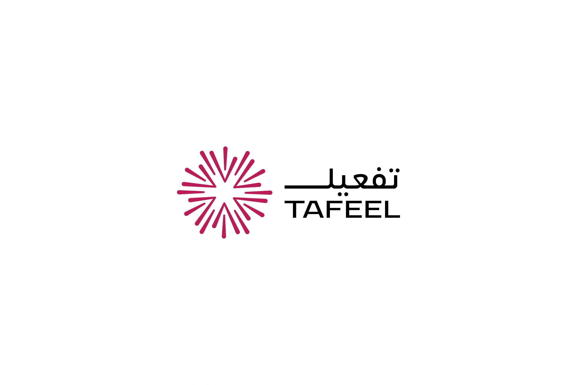
Logo and Identity System A structured and minimal logotype supported by a modular design system built around the idea of flow and clarity
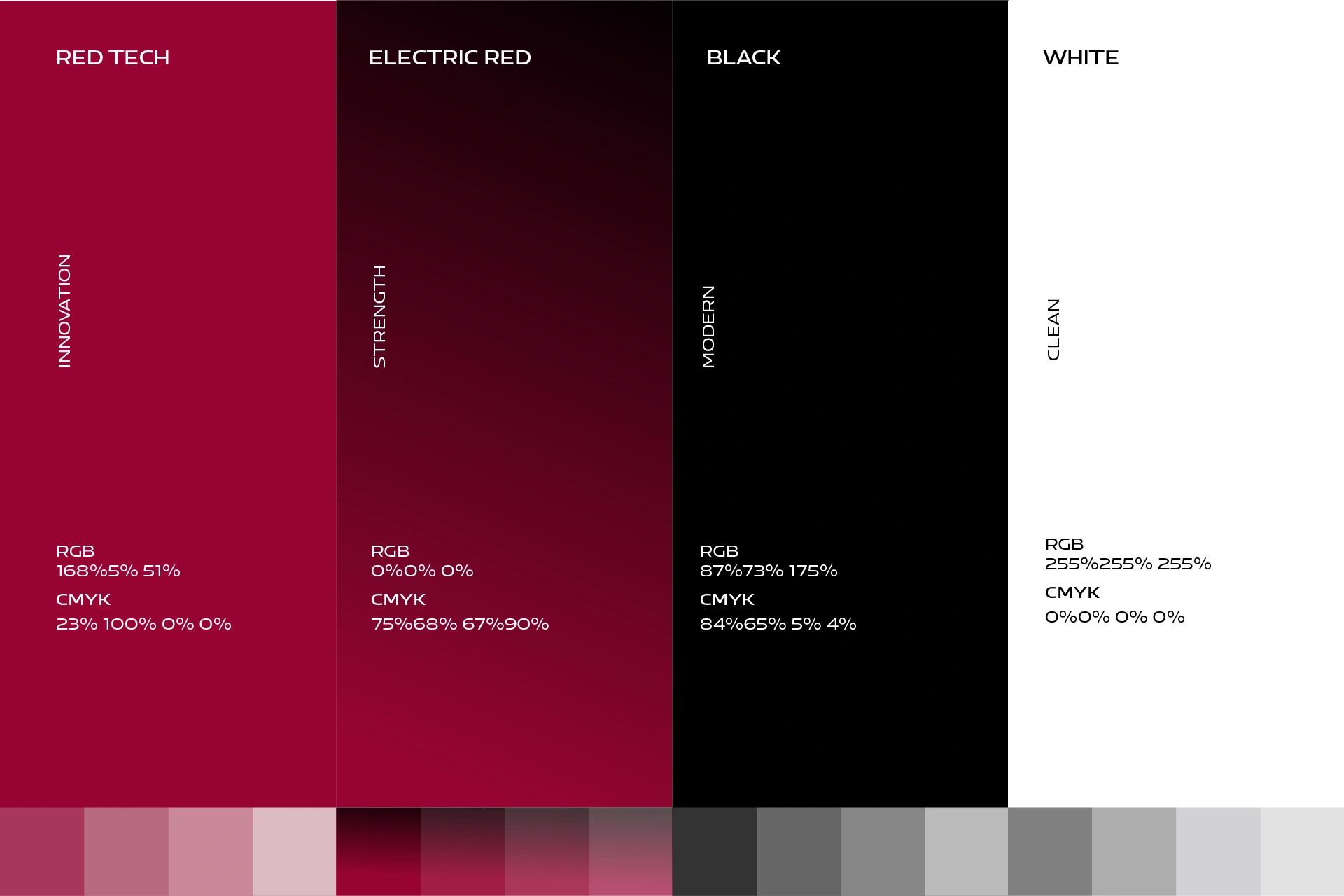
Color Palette A confident digital blue combined with gradients that represent progress and layers of transformation
Typography Professional yet accessible sans serif fonts chosen for digital scalability and legibility across UI interfaces
Creative Writing Messaging built around user empowerment with taglines like Built Around Your Vision and Where Ideas Become Systems
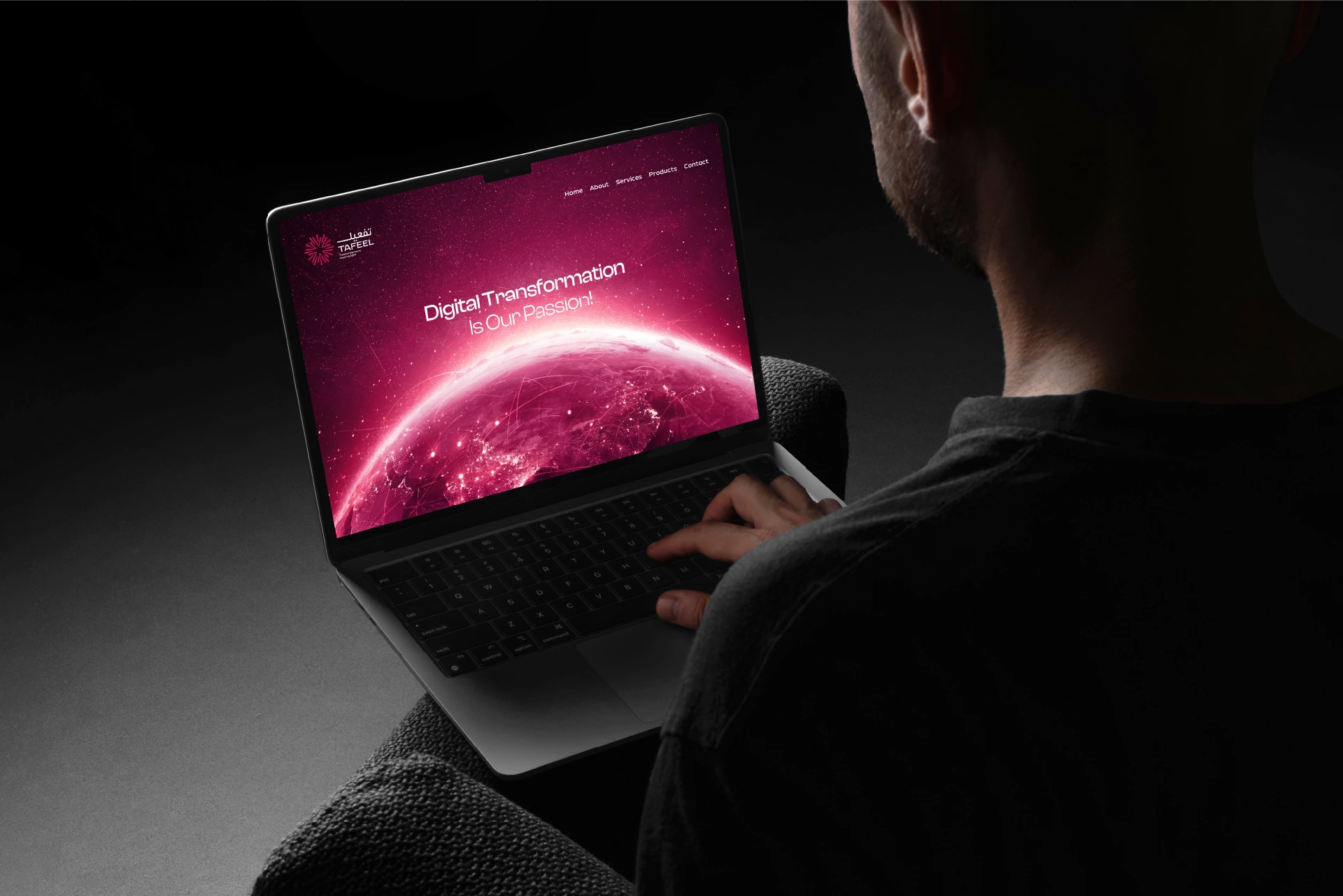
Web and UI Design A clean modular interface with intuitive navigation designed to explain complex services with ease
Brand Guidelines Full documentation covering logo rules, color combinations, UI principles, iconography, and digital content usage
The Results
Tafeel’s rebranding reinforced its position as a key player in the digital transformation space. It attracted new government projects, supported smoother onboarding for B2B clients, and created internal alignment around a clear strategic voice. The brand’s identity now matches the innovation and intelligence behind the services it delivers.